WCAG 2.1: Surpassing accessibility standards for high-quality user experience
Jan 1, 2023
Accessibility, Visual Design
Accessibility is a valuable and required feature of digital products.
Accessibility contributes to our program's goal of building the future of medical device quality standards and collaboration. Accessibility goes further than just meeting color contract standards. It involves designing an app that embraces clarity. It's labeling and navigation for screen readers, clear language, and alternate content formats. And it's simple to plan with a designer who lays out what low-cost, high-impact changes are needed. Our team of ten collaborated on defining technical scope (5), feature updates (7), development (6), and QA (3) - I contributed toward technical scope, feature updates, and QA.
We defined, designed, and scheduled product updates that surpassed WCAG 2.1 AA standards over 7 months.
Our team collected the required changes and prioritized them by time and effort.
With two other team members on QA, I defined the changes needed to surpass all unmet A and AA standards as well as meet many AAA recommendations. We collaborated with development for accurate effort estimations and got tickets scheduled with implementable solutions.
Complex Document into a Secure Online Form
Converted the hours spent on a spreadsheet which might not save your changes to an online form that has optional reminders on what's needed for each entry. It automates data submission and enters it into dashboard views synchronously.

Accessibility uplifts the entire functionality and interaction design of an application. We improved and updated our compliance across the board.
Perceivable, Adaptable, & Distinguishable
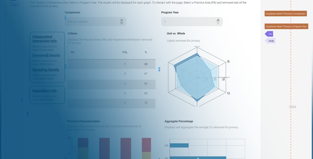
We already had most AA recommendations such as alt text, structure labels, and color contrasts, we upgraded our dashboard with current WAI-ARIA labeling best practices and improved screen reading and scaling.
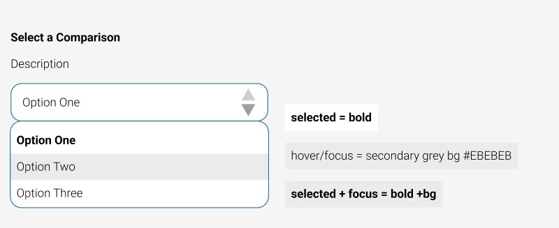
Our design system was built with distinguishable states and labels for applicable all interactive components including links, hover, selected, focused, and error states.
Operable
We designed a seamless page structure, navigable by screen readers, keyboards, touch, and mouse, including clearly labeled primary and secondary navigation, settings pop-ups, and interactive graphs, selectors, and forms.
Understandable
Since program data is sensitive and session timeouts were required, we redesigned a straightforward and accessible user flow for refreshing the session or logging out.
We made consistent loading animations for all our pages to account for data pull times.
We updated copy, link text, and labels to be concise and informative while maintaining the context of necessary technical language.
The VIP Portal is now a seamless experience for those using most combinations of senses and interactive technology.
Our users responded positively to the updates as they were implemented with 72% of interviewees saying they enjoyed using the application with smoother animations, clearer instructions, and easy-to-navigate content.
Recent Posts
UI Examples
Jan 1, 2025
VIP Portal: Modernizing & expanding medical device quality testing
Jul 28, 2023
WCAG 2.1: Surpassing accessibility standards for high-quality user experience
Jan 1, 2023
Clean Home Tech: Connecting customers to healthier home technology online
Dec 1, 2020
Bombay Poets' Archive: Interactive teaching application for international archive
May 1, 2017


